Saturday, 23 February 2013

How to make an Art Portfolio


How to make an Art Portfolio

e-book series


I am taking time out in 2013 to write a series of e-books, starting with, "How to make an Art Portfolio".

My aim is to show that it is easy to create a fantastic portfolio if you are willing to think creatively and work hard. The e-book series will give you guidelines, information and examples, whether you want to make a portfolio for application at an art school or just as a personal record of your art.

I will be blogging about the progress, so keep an eye out for new posts. 

As a result of this new venture, there will be no art classes until further notice.

 “Art is not what you see, but what you make others see.”
Edgar Degas

Turpan Pendi - the lowest place on earth. Acrylic on canvas - from a satellite image by Sane-Mari 2011.


Friday, 19 October 2012

Drawing Lessons


Drawings lessons

 for children

7 - 12 years

  Drawings lessons will resume on 17 November 2012.


The next lesson will be on 17 November from 14h00 to 16h00,
at the St Heliers Community Centre, St Heliers Bay Road, Auckland.

E-mail me at info@theartworkshop.co.nz  to make a booking.
The morning lesson, in Bucklands Beach, Auckland  will resume next year with the start of school term 1. More details to follow.

Remember the FIRST lesson is FREE! Give it a go!

Wednesday, 10 October 2012

Drawing Victorian Houses

Drawing Victorian Houses

This lesson proved to be great fun for all the students (aged 7 -11) attending the class. We learned that Architecture is the designing and building of structures. We discussed Victorian Architecture in brief,e.g where did the name come from. Some students knew the answer - England's Queen Victoria off course. We learned that Victorian Mansions were different from other houses because they were impressive and symbolized hospitality. They had unique features and distinctive color schemes. We looked at several pictures of Victorian Houses (from library books and the internet).

On the black display board wall I built (as a basic construction) a Victorian House from basic shapes cutouts. This served as an example to remind the students that essentially you can construct a Victorian house using squares, rectangles, half circles columns and triangles.

I gave the students free choice to use stencils, cut out shapes and rulers to construct their Victorian House. After "Building" the houses they used colored pencils or markers to decorate their houses.  Below are photos of some of the students work.


 I got the idea for this lesson from the Deep Space Sparkle blog.

Tuesday, 2 October 2012

Drawing with Basic Shapes

Silhouette drawn with fine pens on a watercolour background.

Often, at first glance, things will appear to be complicated and most beginning artists will not attempt to make a drawing of what they see.

If you start looking closely you will notice that almost everything is made up of basic shapes, such as circles, dots and lines. 

Drawing becomes much easier if you are able to recognise the shapes in simple as well as complex pictures.

The secret is to build onto the basic shapes in a step by step process.

Why is it easier to draw something when you first draw the shapes?

Because we can all draw basic shapes. See below for examples.


There are many more shapes in geometry as well as nature. Take an old magazine, choose a picture and see how many shapes you can identify. Deconstruct every picture and you will notice how easy it will be to draw that picture. Be aware that the basic shapes might be hidden. Also remember that you might need to change the basic shape slightly to draw the hidden shape, e.g a lopsided oval or triangle.

Be creative and explore basic shapes!


Tuesday, 25 September 2012

Draw like a child


 Follow this link  and see some of the work one of my students have done since May 2012.
 
https://www.facebook.com/pages/Alexanders-Artwork/202912303130464?ref=hl

He would love to hear what you think of his work.  He is 10 years old.

Freehand abstract design using basic shapes


Sunday, 23 September 2012

Texture


Lesson on texture.

What is texture?

Texture indicates whether an object is course, smooth, rough, crinkled etc. 

Rough


Crinkled

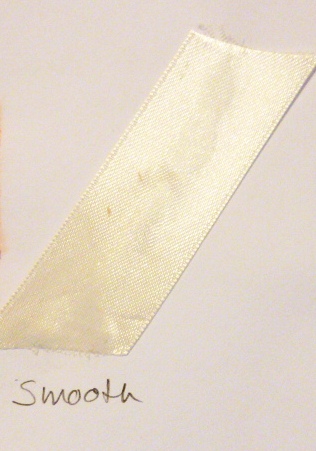
Smooth

Why do we need to draw texture?

  • to highlight certain areas of the drawing
  • avoid visual monotony
  • create a greater degree of realism

Texture marks

Texture marks could include Hatching, Cross hatching and Double cross Hatching 


Another very effective way to make objects in drawings "come alive", (e.g. furniture) is is the technique called Frottage.
  • Frottage is a specialist technique and is not restricted to pencil and paper.
  • The term comes from the French verb "frotter" which means "to rub".
  • This is how you do it:
    • Place a piece of paper over a textured surface or an incised pattern. Thin paper works best.
    • Then rub a soft pencil over the paper.


 Why would you use frottage:
    • To create areas of patterns or textured drawing, e.g. patterns of woodgrain on a piece of timber in your drawing could make it look realistic. Effects will vary according to the types of paper and pencil you use.
    • Preserve an engraving on an object, e.g. a brass bell or gravestone.
    • Some textures will work well when drawing clothes on people or sofas.

Did you find this useful? Write a comment on this blog 

or e-mail me at info@theartworkshop.co.nz

Saturday, 15 September 2012

Tone and Shade


Following on from the getting started lesson, the next step will be to draw a tone wheel.

Remember it is not necessary to use a different pencil every time you want a slightly different tone. Just increase or decrease the pressure of the pencil on the paper.

It is a good idea to draw a tone wheel for all the pencils you will use for drawing, but possibly not the H or 2H as they will not yield the same effect. The drawing below was made with a 2B pencil.


White appears to be coming forward in the picture and the dark (black) appears to recede.
A slight grey tone around the edges softens the image and it gives a rounded look.
A light grey tone or soft grey (in pencil drawing) is used for anything from the sky to skin tone. It is a very versatile tone.
Dark grey tones are used for dark shadows and possibly thunder clouds and often used in stead of black.
Black tone is very intense and not often used. Remember it is very difficult to erase black.

Artists use shading (tone) for various reasons:
  • It softens the appearance of an image
  • it makes an image look solid
  • it adds variety
 Can you see the difference?


Both the left and right image started off being the same sized circles. The circle on the left was shaded in the same tone and remained a circle or dot.  The circle on the right was shaded using different tones in such a way that considers the direction of light, e.g shining from the right hand side. This action created an object that looks like a ball or sphere.


Did you find this useful? Write a comment on this blog 

or e-mail me at info@theartworkshop.co.nz